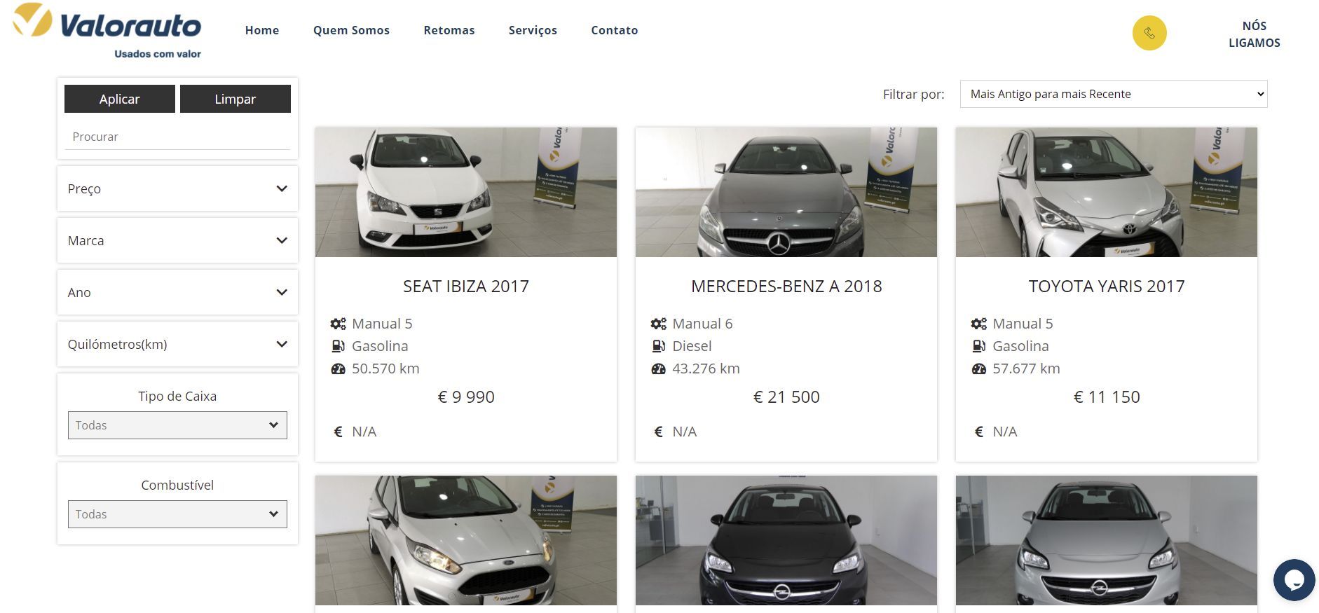
SEO FRIENDS
Sites designed to be found online. Talk to your SEO consultants.
Enjoy and enjoy one of the best tools for SEO Portugal.
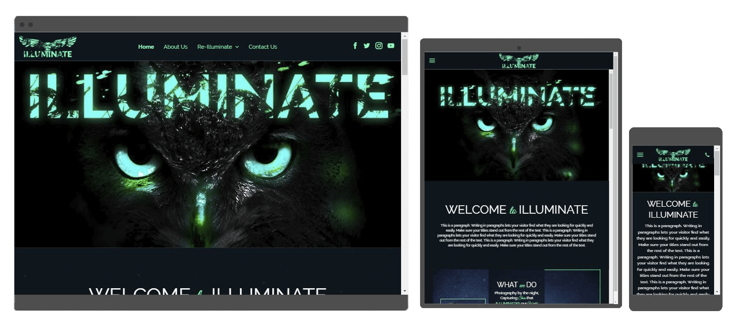
BUILT FOR MOBILE
Multi-screen websites optimized for desktop, tablet and mobile. Provide a fantastic user experience on any device. This increases the likelihood of your customers' involvement.
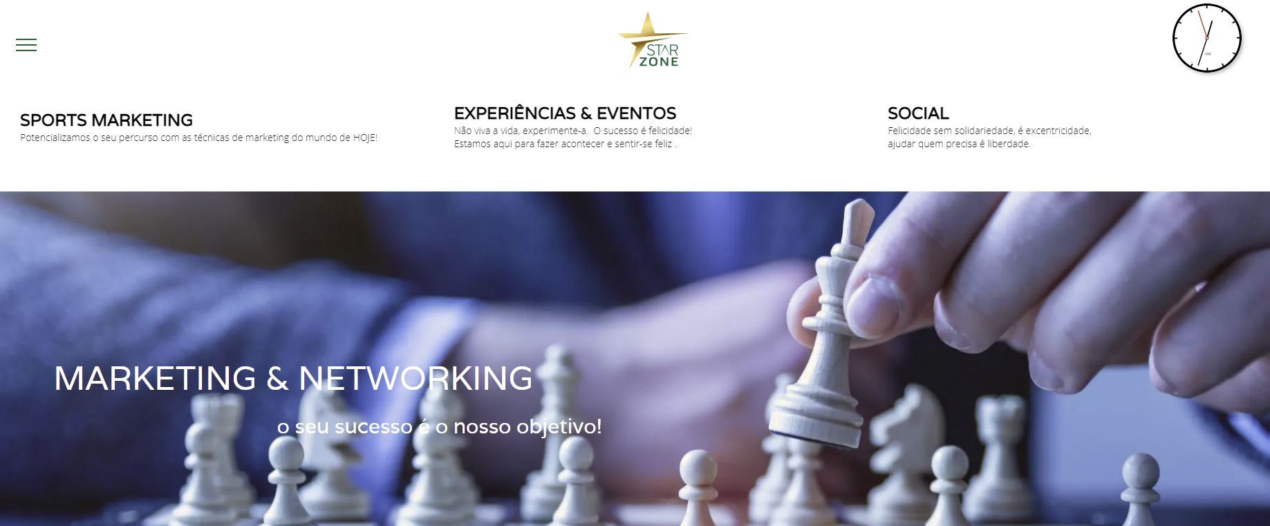
SMART
MARKETING
We develop advanced marketing resources that encourage sales through personalized messages.
ADVANCED
ANALYTICS
We will help you to clarify your message with clear and attractive content.
ULTRA
FAST
Speed leads to greater visibility in searches, which in turn results in customers spending 70% more time on your site.
ADVANCED
e-COMMERCE
Take advantage of our Ecommerce solution that makes sales while you sleep.
Let us build your Online Store.
MANAGEMENT
SIMPLIFIED
Take advantage of our Ecommerce solution that makes sales while you sleep.
Let us build your Online Store.
CONTENT MARKETING
Take advantage of our Ecommerce solution that makes sales while you sleep.
Let us build your Online Store.


